Materials
- simplicity with moderation
Minimalism
- its evaluations and problems
I am of the opinion that it is always wise to use materials according to their own characteristics, texture and color. For example, we use reinforced concrete only for structural parts and give transparent coating to the surface so that everyone can see the reinforced concrete supporting the building without any ornaments. We use highly transparent glass and steel for facades and the roof constructions, and the most suitable untreated timber for the facades and the floors. But this is not a minimalist approach. Minimalism is, for me, a doctrine which people are forced to follow. Ludwig MIES VAN DER ROHE impressed me greatly but I wonder about his unreserved worship of minimalism and his approach, which brought architecture to the point of absolute abstraction.
Now, I believe, the situation has changed. Architecture today is part of more complex discussions. The pressing issues such as sustainability, global resources limitations, and the importance of communication enriches as well as complicates architecture. Therefore, there is no need to follow Mies' path to absolute abstraction any longer. For my parts, I try to minimize elements, while designing feasible and pleasant architecture. What is important in today's architecture is not minimalism. Clarity should be the essence of each concept together width transparent and/or explicit designs. That's why, the design should be simple without being oversimplified.
Beauty lives in design with moderation
We are designing simple architecture, one without unnecessary elements. To reduce elements of architecture in such a way is a rule and a discipline for me. But such reduction has limits. For example, in nature beauty is often a result of complete reduction and complete simplicity. But in my case the concept of beauty is more complicated. I think design with moderation is more beautiful than mere simplification. For example the forms of human bodies are not simple. Humans are complicated existences - and so is architecture and it is beautiful, for that same reason. Architecture contains things that seem to be dispensable. However, none of these elements can be taken away. I believe it is possible to design beautiful architecture with moderate simplification. Katsura-Rikyu (Imperial villa) in Kyoto for example is not decorative, its architectural elements are reduced, but not excessively. This moderation is what makes Katsura-Rikyu so attractive.

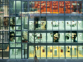
Head Office Stadtsparkasse, Dusseldorf

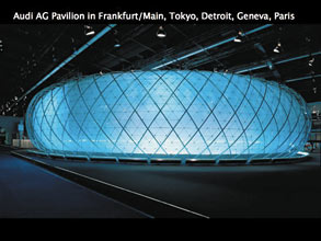
Audi Pavillion in Frankfurt, Tokyo, Detroit, Geneva, Paris


