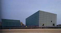
Auditorium-Convention Centre Kursaal / Photo by Ikeuchi Seiji |

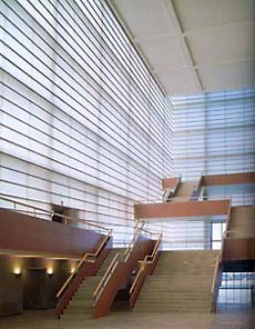
Foyer / Photo by Ikeuchi Seiji |
| |
| Optical Illusions
According to the designer, the large hall was created to seem "as if it is floating within a large square cylinder, from which the center has been removed". Because of this construction, the larger building's foyer was planned so that walking through it, one can arrive at the top floor without knowing it. Once reaching the top floor, there are transparent windows opening out towards the ocean. Apart from this, the only other such windows are the two on the foundation level. It may seem odd that the design would obstruct the view in such scenic surroundings, but the effect is just the opposite: it actually serves to enhance the appeal of the setting.
In the smaller hall, there is hardly any asymmetry between the inner and outer walls, as compared to the larger hall, but the construction of the foyer is the same, with only one window facing the outside world.
|
| The Appeal of Translucent Walls
What made it possible to achieve an aesthetic advantage through concealing the view was the concept of "creating a bright indoor space while maintaining ambiguity". If regular opaque walls had been used, the complete obstruction of the outside view would have been stifling, and it would not have been possible to create an appealing space.
Upon the steel frame construction, both on the inside and on the outside, there are two layers of glass with a milky white film. During the day, from hour to hour, the sun's rays cast differing aspects of light through the milky glass. At night, the glass turns it into a dazzling, luminous box on the San Sebastian shore. Apart from the glass walls, the floors and hall-side walls are made of wood, which lends a warmth to the space.
|
|
(written by editor) |
|